Project Overview
For the Google UX Certification through Coursera, students were tasked with designing an app to solve a problem for potential users. Students worked through all stages of the UX designing framework: Empathize, Define, Ideate, and Prototype & Test. The certification also prepared students for UX Research, giving mock and template scenarios for best practices when collecting data, feedback, and insights.
UX Subjects Covered:
- Empathy Maps
- User Personas
- User Stories
- User Journeys
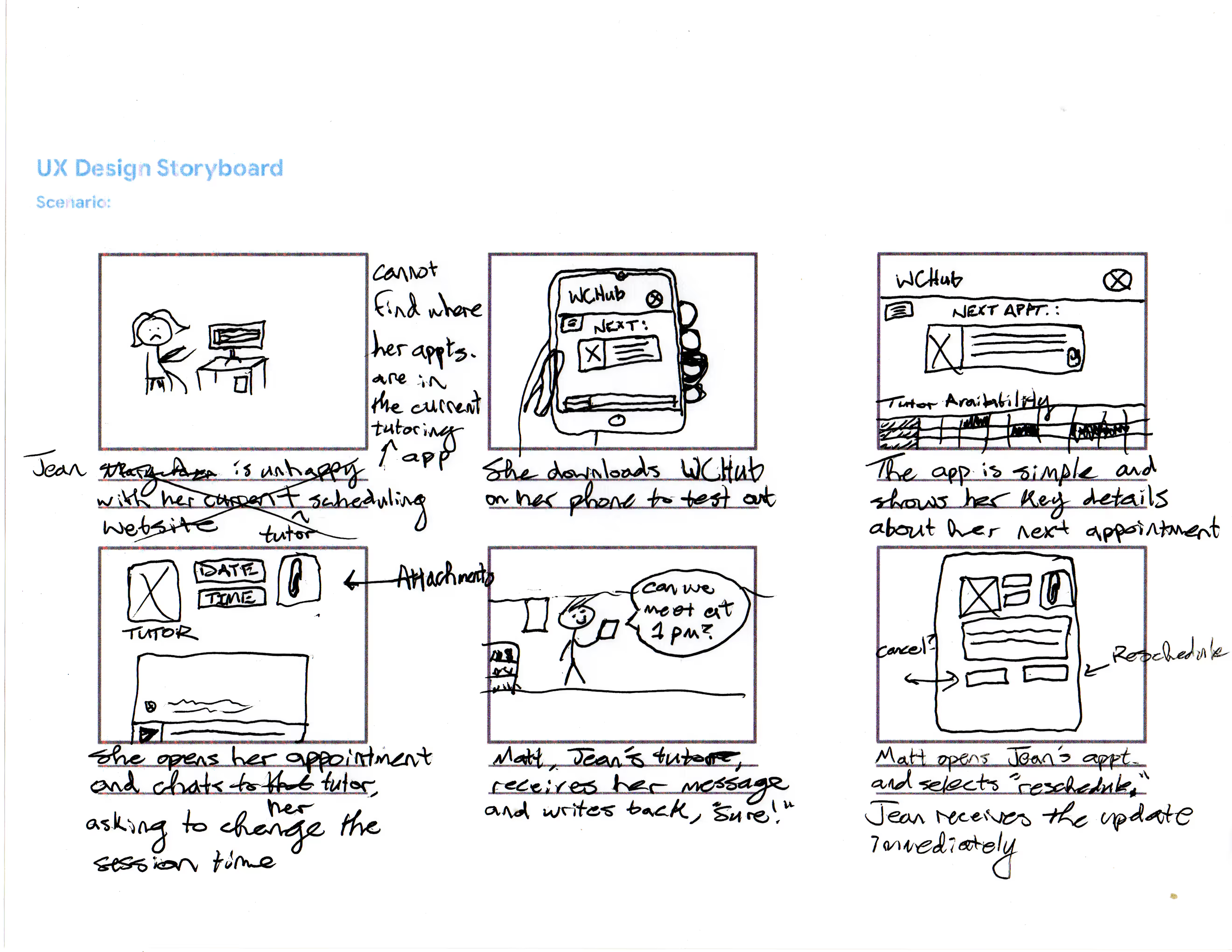
- Storyboarding
- Rapid Sketching/Crazy Eights
- SCAMPER
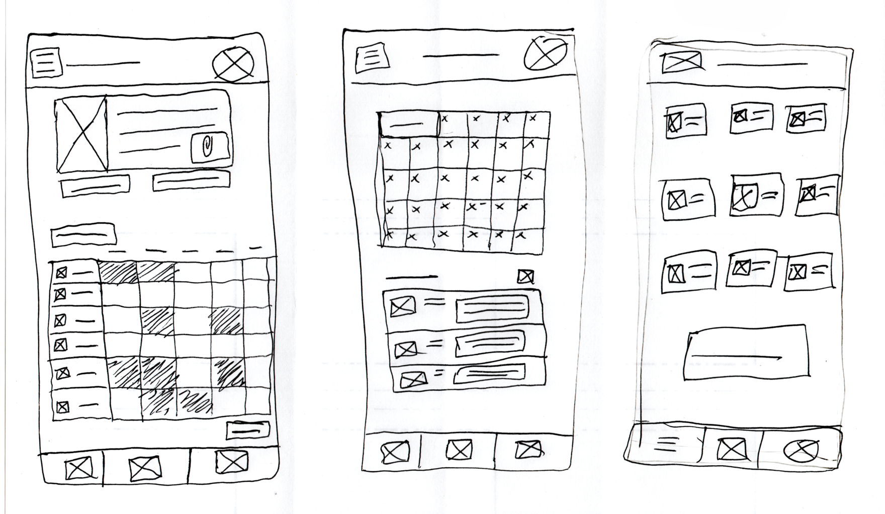
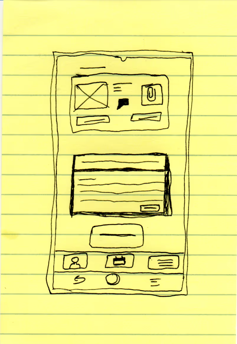
- Wireframing
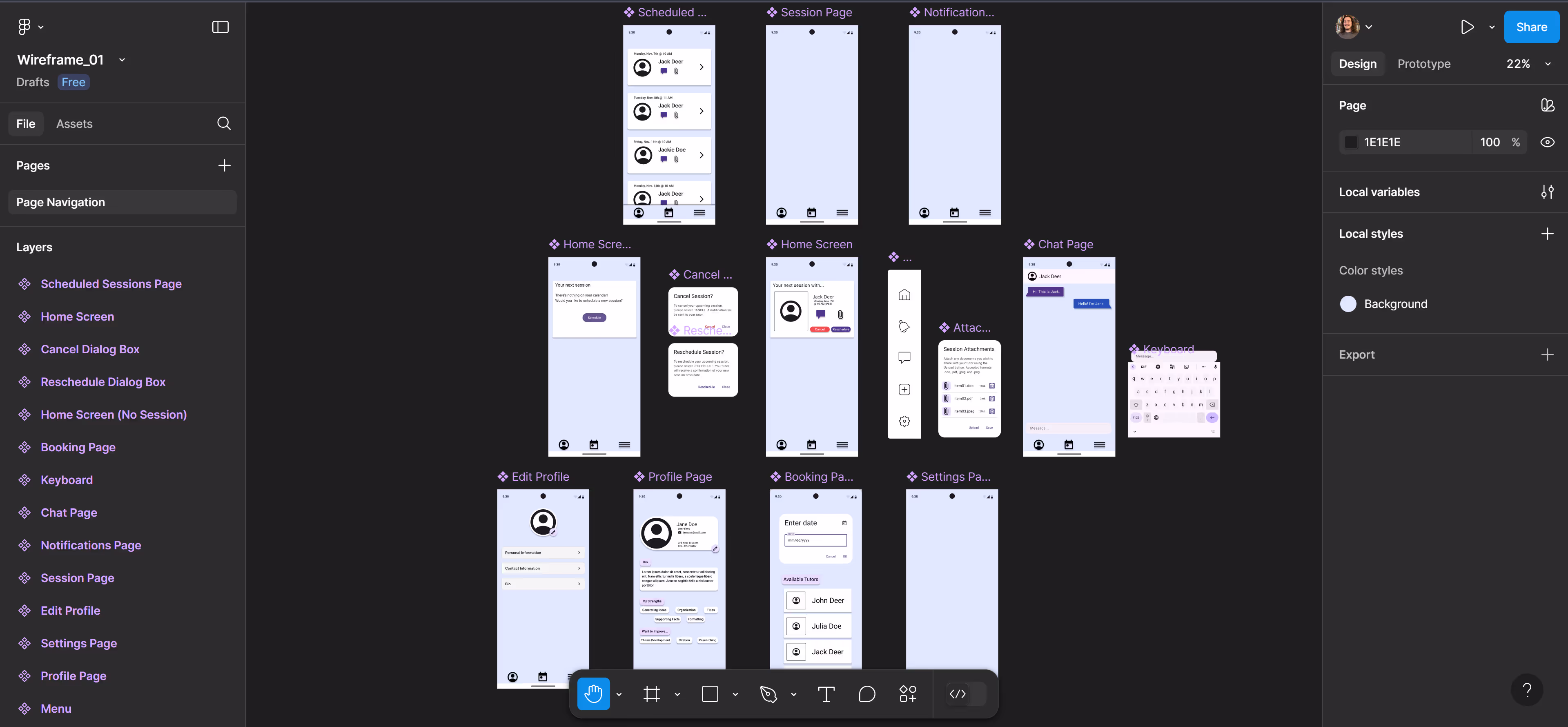
- Low & High Fidelity Prototypes
- Mockups
- Competitor Audit
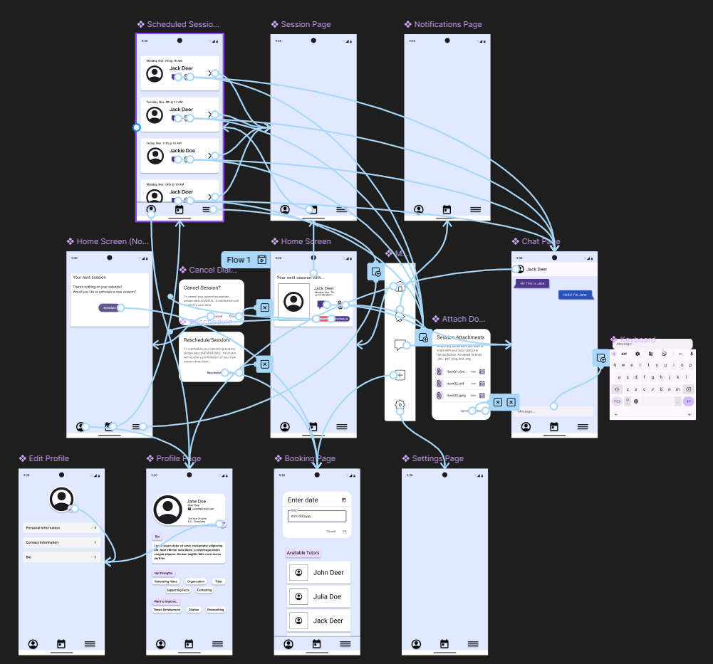
My Project
When I started the course, I already had the app I wanted to develop in mind.
Back in my undergrad, I was a writing tutor for my university's Writing Center. At the time, we were using the biggest (and only) writing center website to do everything: schedule tutors, book appointments, correspond with students, upload documents, collect feedback/data, and manage user accounts.
Overall, my experience with the website was pleasant, but even back in 2017, I thought the site looked very barebones. I also overheard my supervisors' struggles with the design team. When they would express problems with certain features or requested a tweak to better suit our needs, the design team was hesitant to listen, let alone make changes.
Thus, when I started the Google UX Certification, I already had plenty of ideas for a better kind of website/app. What you'll find below is all my work put toward this fictional app of mine. Perhaps one day, with more experience in development and with others, the app could enter the real world!
.png)
.png)